If you close your eyes and think of the Adele 25 album cover, you probably see those eyes first. Not just any eyes, but that sharp, liquid-liner stare that launched a thousand makeup tutorials. It’s iconic. It’s everywhere.
But honestly? People forget how much of a massive risk that photo was at the time.
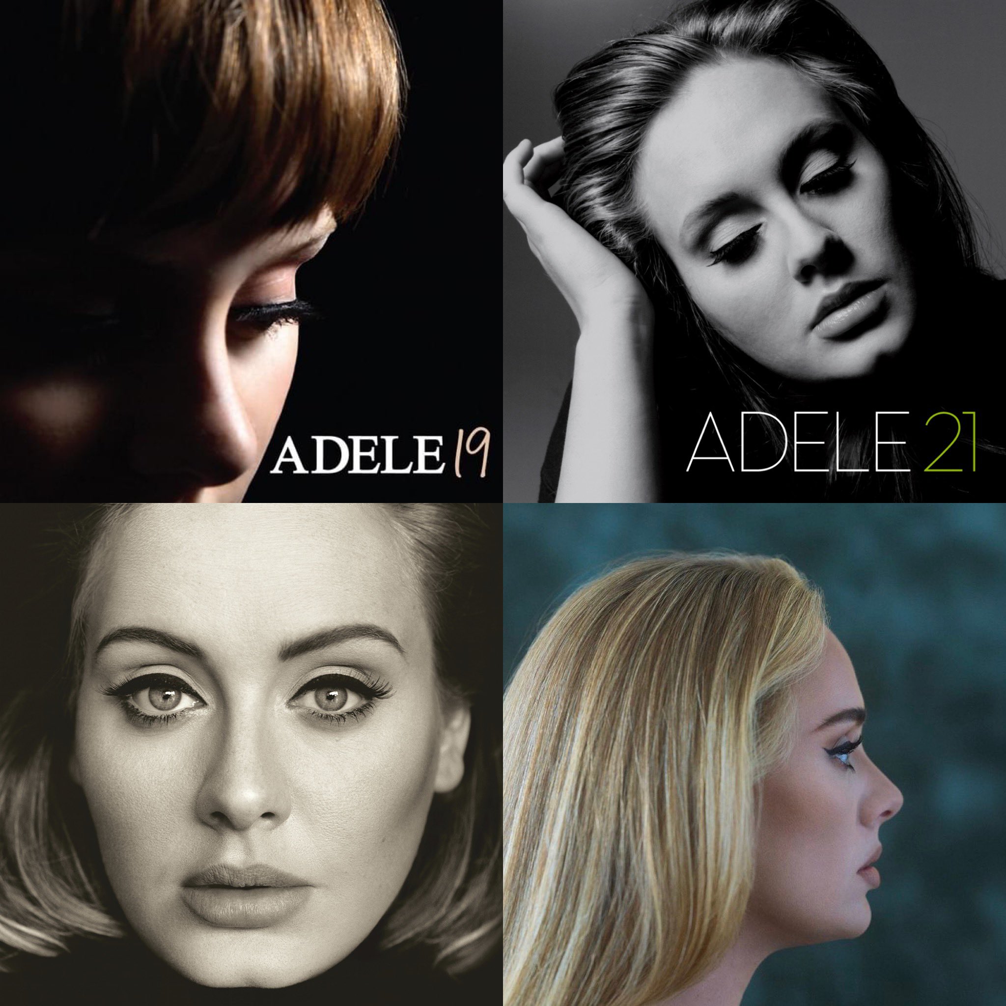
Before 25 dropped in 2015, Adele was the queen of the "guarded" aesthetic. Look at the cover of 19. She’s looking down, shrouded in shadows, almost hiding from the listener. Fast forward to 21, and her eyes are closed. She’s internalizing the heartbreak, keeping the world at arm's length even as she sells millions of records. Then comes the Adele 25 album cover, and suddenly, the wall is gone.
She’s looking right at you. No more hiding.
The Photographer Behind the Gaze
The man responsible for this shift was Alasdair McLellan. If you follow fashion or music photography, you know his name. He has this knack for making celebrities look like real people while still keeping them looking like, well, stars.
McLellan shot the cover in London, and he’s gone on record saying that the direct eye contact was very intentional. Adele wanted it. She wanted the frame filled with her face. No distractions. No "lifestyle" background. Just a woman and her audience.
What’s wild is the technical simplicity. It’s a tight crop. It’s sepia-toned—though many people mistakenly call it black and white. If you look closely at a high-res version or the actual vinyl, there’s a warmth to it. It’s not the cold, stark monochrome of a 1940s noir film. It’s softer. It feels like a memory that’s still warm.
Why the "Upside Down" Meme Broke the Internet
You’ve probably seen it. The "Adele Optical Illusion" or the "Thatcher Effect" version of the Adele 25 album cover.
Some prankster took the cover, flipped it upside down, but left Adele’s eyes and mouth the "right" way up. When it’s upside down, your brain thinks, "Oh, that’s just Adele’s face." Then you flip your phone over and—BAM—she looks like something out of a horror movie.
It went viral years after the album came out because it proved just how symmetrical and "perfect" the original composition was. Our brains are hardwired to process faces right-side up. When the features are distorted but the orientation is flipped, we just miss it. It’s a testament to how the cover’s simplicity makes it the perfect canvas for internet culture.
The Makeup That Defined an Era
We can't talk about the Adele 25 album cover without talking about the liner.
Makeup artist Michael Ashton is the guy who spent years perfecting that "Adele wing." For this shoot, the goal wasn't just "pretty." It was "statuesque." The lashes are heavy, the brows are defined, and that cat-eye is sharp enough to cut glass.
It’s a "makeup album," as Adele herself once called it. Not just because of the cosmetics, but because the songs were about making up with herself. The cover art reflects that. It’s the "after" photo. She’s put her face on. She’s ready to talk.
Breaking Down the Symbolism
- The Eye Contact: This was the "A-bomb" moment. By looking directly into the lens, she’s taking accountability.
- The Sepia Tone: It bridges the gap between the vintage soul of her music and the modern production of the tracks.
- The Grain: McLellan kept the texture. You can see the skin. It hasn't been airbrushed into a plastic doll.
Critics at the time, like those at ICON Magazine, argued the cover was "safe." They saw it as a sales-driven aesthetic that fit perfectly into the "female singer-songwriter" box. But looking back, that "safety" was actually a form of brand solidification. It made her recognizable in a way very few artists are. You don't need her name on the cover. You just need those eyes.
A Legacy in Print
Since 25, we've seen 30. On that cover, she’s in profile, looking away again. It makes the Adele 25 album cover stand out even more as the singular moment where she stood her ground and looked the world in the eye.
It’s more than just a photo. It’s the visual shorthand for a record that sold 3.38 million copies in its first week in the US alone. You don't move those kinds of numbers with a bad cover.
Next Steps for Collectors and Fans:
If you’re a fan of the visual side of Adele’s career, check out the i-D Magazine "The Here and Now" issue from Winter 2015. It features more shots from the same McLellan session that didn't make the album cover. Also, if you own the CD, take a look at the booklet photography by Alexandra Waespi. It offers a much more candid, "behind-the-scenes" look at the 25 era that balances out the intense, formal stare of the main cover art.