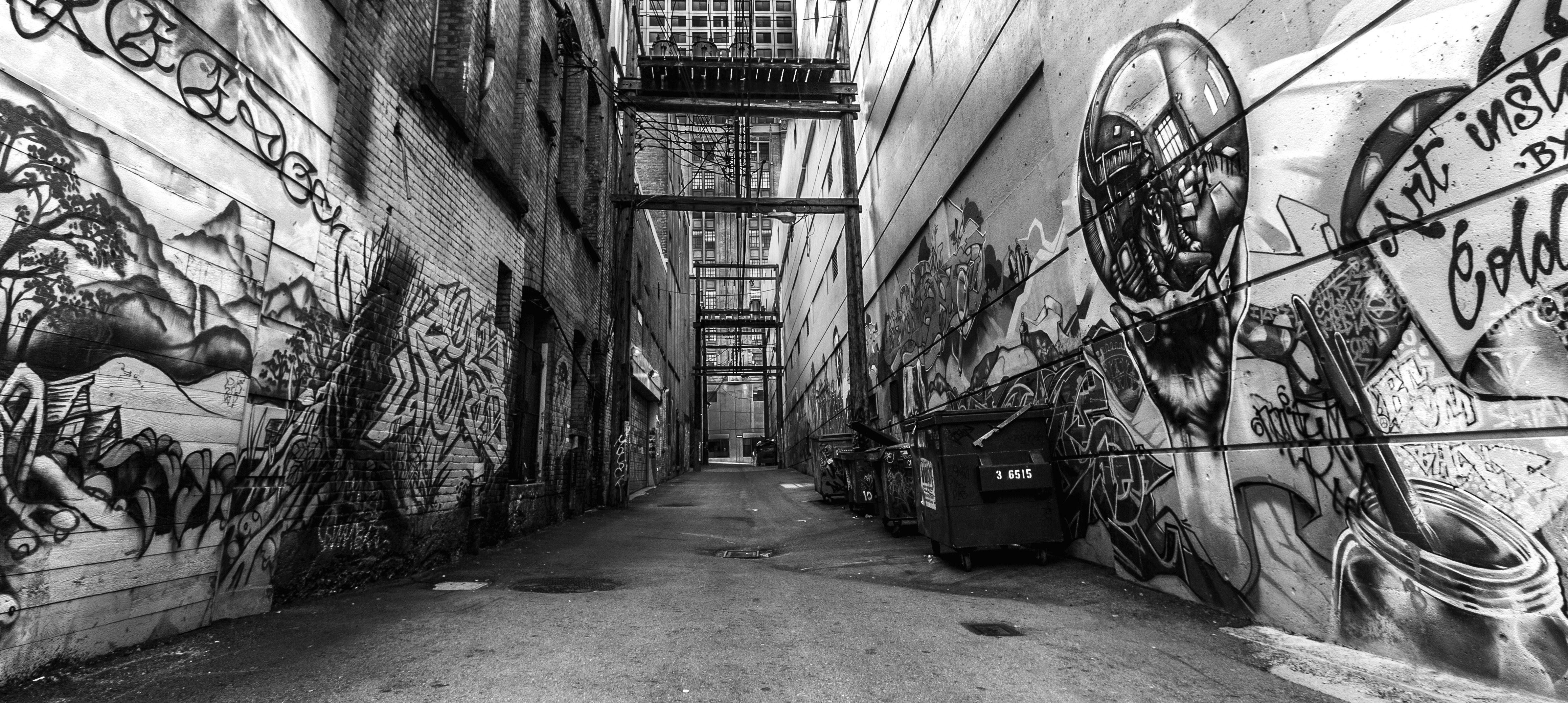
You’re walking down an alleyway in a city like Berlin or New York, and your eyes are basically vibrating from all the neon murals and massive, multi-colored productions. Then, you see it. A single, crisp piece of black and white graffiti art tucked into a corner or slapped onto a rusted roll-down gate. It’s sharp. It’s aggressive. It’s weirdly more visible than the rainbow next to it.
There's a massive misconception that working in monochrome is just a beginner's phase. People think artists only use black and white because they can't afford a full rack of Ironlak or Montana Gold cans. Honestly? That’s rarely the case. While a single can of black spray paint and a chrome or white bucket is cheaper, the choice to strip away color is usually a deliberate aesthetic or tactical move.
Black and white is the skeleton of the graffiti world.
The Raw Power of the "Throw-Up" and "Piece"
If you want to understand why black and white graffiti art is the backbone of the culture, you have to look at the "throw-up." A throw-up is that bubbly, two-color style you see everywhere. It’s meant for speed. When a writer is hitting a high-risk spot—think a highway overpass or a subway layup—they don't have twenty minutes to blend sunset gradients. They have three minutes.
Black provides the outline. White or silver provides the fill.
The contrast is high-voltage. Because there’s no color to hide behind, the letter structure has to be perfect. You can't mask a shaky hand or a bad "S" curve with a pretty purple-to-pink fade. It’s just you and the line work.
Why Contrast Beats Complexity
In the world of visual psychology, our brains actually process high-contrast imagery faster than complex color palettes. This is why road signs are often black and white or black and yellow. Graffiti writers know this instinctively. A piece of black and white graffiti art pops against the grey concrete of the "urban desert" in a way that deep reds or blues just don't.
Think about the legendary artist REAS (Todd James) or the iconic Giant. Their work often leans heavily on the bold, comic-book-style weights of black and white. It’s about legibility and "pop." When you take away the color, you’re left with the "swing" of the letter—the rhythm of the spray.
The "Silver Piece" Phenomenon
Go to any train track in Europe or North America and you’ll see "silvers." These are huge, blocky letters filled with chrome paint and outlined in black. Technically, silver is just a metallic white, but in the graffiti subculture, it’s the gold standard for visibility.
Silver paint has a different chemical makeup. It's high-pressure and covers everything. If a wall is dirty, porous, or already covered in other tags, a chrome fill will kill it. It "buffs" the wall underneath. This is why black and white graffiti art isn't just an artistic choice; it’s a dominant one. It says, "I am covering everything that came before me."
It's basically the ultimate power move in the street art hierarchy.
When Fine Art Meets the Street: The Monochrome Shift
It’s not just about "bombing" or illegal tags, though. The gallery world has a massive crush on monochrome street aesthetics. Look at Retna. His work—a unique script that looks like a mix of Arabic, Hebrew, and Old English—is almost always executed in stark black and white.
Why? Because it feels like a manuscript.
When you use black and white graffiti art in a gallery or a high-end mural, you’re referencing the history of calligraphy and printmaking. It feels "serious." It feels like it belongs in a museum just as much as it belongs on a freight train. There's a certain gravity to it.
The Influence of Noir and Punk
Graffiti didn't grow up in a vacuum. It was raised by the same gritty, DIY culture that gave us punk rock zines and Film Noir. Those zines were photocopied on cheap Xerox machines, resulting in high-contrast, grainy images. That "crusty" look migrated onto the walls.
Many artists, like the French stencil legend Blek le Rat, used black and white to create a sense of realism. If you paint a life-sized rat in full color, it looks like a cartoon. If you paint it in black and white using a stencil, it looks like a shadow. It looks like it’s actually part of the city.
It’s subtle, but it’s also terrifyingly effective.
Technical Challenges Most People Ignore
People think painting in B&W is easy. They're wrong.
When you’re working with a limited palette, you have to master "half-tones." You do this by varying the pressure on the cap or using "dusting" techniques. If you want a shadow in black and white graffiti art, you can't just pick a darker shade of blue. You have to learn how to make black look like grey by spraying from a distance.
- Cap Control: You need a "skinny cap" for those hair-thin white highlights.
- The "Fill" Speed: Using "fat caps" to dump silver paint onto a wall before the cops show up.
- The Outline: It has to be "one-take." No corrections. If you mess up a black outline on a white fill, you have to start the whole section over.
There's no room for error. It’s a high-wire act with a spray can.
The Evolution of "Anti-Style"
In the last decade, a movement called "Anti-Style" or "Ghetto Goth" has taken over certain parts of the graffiti world. It rejects the pretty, colorful "Wildstyle" of the 1980s. Instead, it embraces messy, scratchy, and purely black and white forms.
It's intentionally "ugly," but in a way that is incredibly sophisticated. Artists like FUZI UVTPK popularized this "ignorant style" which often mimics the look of a bad prison tattoo. It’s raw. It’s meant to look like it was done in a rush, even if the artist spent hours planning the "perfectly messy" lines.
This movement has huge ties to the fashion world. You’ve probably seen these black and white graffiti art motifs on high-end streetwear from brands like Off-White or Balenciaga. They aren't looking for the pretty murals; they want the grit of the monochrome tag.
Iconic Black and White Artists You Should Know
You can't talk about this without mentioning Banksy. Yes, he uses color sometimes, but his most iconic pieces—the "Girl with Balloon" or the "Flower Thrower"—are essentially black and white stencils. He uses the white of the wall as his light source.
Then there’s VHILS. He doesn't even use paint in the traditional sense. He "sculpts" graffiti by chipping away at layers of posters and plaster on the sides of buildings. The result is a monochrome portrait made of shadows and debris. It’s literally "reductive" art, and it’s some of the most stunning black and white graffiti art on the planet.
And let's not forget the "Handstyle" masters. Writers like Faust in New York take calligraphy to an extreme level. When he tags a snow-covered car or a glass window with a black marker, it’s a masterclass in typography.
How to Get Started with Monochrome Graffiti
If you're an artist or just someone who wants to appreciate the craft, don't start with 50 colors. Start with two.
- Focus on the "Bone Structure": Spend a month just sketching in a black sketchbook with a white charcoal pencil. Or a white piece of paper with a black Sharpie.
- Master the Weight: Learn where the "downstroke" of a letter should be thick and where the "upstroke" should be thin.
- Experiment with Negative Space: Sometimes, the most important part of black and white graffiti art is the part you don't paint. Use the wall's natural color as your secondary tone.
- Buy a "Mop": Get a high-quality black ink mop. Practice the drips. Drips look intentional and "street" in black, but they can look messy and accidental in neon colors.
The Actionable Truth
Whether you’re a collector, a fan, or a creator, understanding the power of the monochrome palette changes how you see the city. It’s not about a lack of resources; it’s about the presence of discipline.
The next time you’re out, look for the silvers. Look for the black tags that seem to vibrate against the brick. Notice how they demand your attention without needing to scream in color.
Next Steps for Enthusiasts:
- Visit a "Hall of Fame": Most major cities have legal walls (like the Bushwick Collective in Brooklyn or Le Mur in Paris). Search for the sections that use only B&W and compare how they hold up against the colorful pieces from a distance.
- Study Typography: Grab a book on Gothic or Fraktur calligraphy. You’ll see exactly where the most famous graffiti "writers" got their inspiration for their black and white graffiti art.
- Documentation: Start a photo collection specifically of monochrome tags. You’ll quickly see that the "style" of a writer is much more obvious when color is removed.
The street is a loud place. Sometimes, the best way to be heard is to speak in black and white.