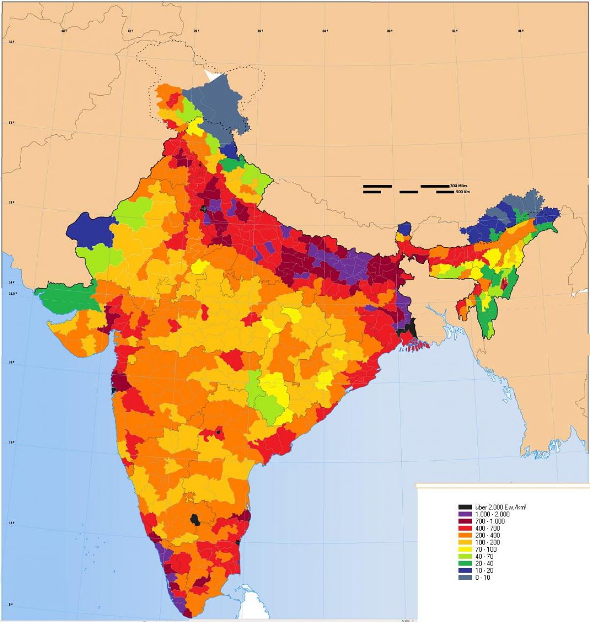
Ever walked through a market in Old Delhi and felt like you were sharing oxygen with a thousand people? Or maybe you've stood on a silent hilltop in Arunachal Pradesh where the only sound was the wind. That's India for you. It's a land of extremes, and nothing shows this more clearly than an india population density map.
Honestly, the numbers are staggering. As of early 2026, India is home to over 1.45 billion people. But they aren't spread out like butter on toast. Instead, they’re clumped together in specific pockets, leaving other parts of the country practically empty. If you look at the latest mapping data, you'll see a massive "red zone" stretching across the north, while the edges of the country fade into cooler, emptier shades.
The Northern Crush: Where the Map Bleeds Red
If you want to understand why the india population density map looks so lopsided, you have to look at the Indo-Gangetic Plain. This is the heart of India’s population explosion. States like Bihar and West Bengal are literally bursting at the seams.
Bihar is a wild case study. It has overtaken almost every other major state in terms of sheer density. We’re talking about over 1,100 people packed into every single square kilometer. To put that in perspective, that’s like trying to fit an entire small village into a space the size of a few city blocks.
West Bengal isn't far behind. The delta region is incredibly fertile, which historically meant more food and more people. But now, it’s not just about farming. It’s about the massive urban sprawl around Kolkata and the industrial belts that pull people in from everywhere. Uttar Pradesh, the heavyweight champion of total population with over 240 million people, actually has a slightly lower density than Bihar because it’s physically larger, but it still clocks in at nearly 830 people per square km.
The Empty Corners: Life at 17 People per Kilometer
Now, let's flip the script. Look at the top right corner of that map. Arunachal Pradesh is a ghost town by comparison.
The density there? Around 17 people per square kilometer.
You could walk for hours and not see a soul. The terrain is rugged, the infrastructure is a nightmare to build, and the climate doesn't exactly invite massive urban settlements. Similarly, the high-altitude deserts of Ladakh and the thick forests of the Andaman and Nicobar Islands show up as tiny specks of low density on the map. It’s a completely different India. One where space isn't a luxury; it’s just the default.
Why the Map Looks the Way It Does
It’s not random. People live where the living is easy—or at least where the jobs are.
- Water is King: Almost every high-density area on the map sits near a major river system. The Ganga, Yamuna, and Brahmaputra aren't just holy; they’re the lifeblood of the economy.
- The Job Magnet: Cities like Bengaluru, Hyderabad, and Pune have seen their local density maps turn bright red over the last decade. Why? The tech boom. People are migrating from the "empty" zones to these "packed" zones for a paycheck.
- Climate Matters: You won't find many people living in the middle of the Thar Desert in Rajasthan. It’s too hot, too dry, and too hard. The map stays pale yellow there for a reason.
The Urban Explosion: Cities vs. States
When we talk about an india population density map, we usually think about states. But the real story is in the Union Territories. Delhi is basically on another planet when it comes to density.
While Bihar has 1,100 people per square km, Delhi has—wait for it—over 11,000.
Actually, some estimates for 2026 suggest that number is pushing even higher in certain pockets of East Delhi. It’s a concrete jungle where every inch of land is contested. Chandigarh and Puducherry also show up as high-density hotspots on the map, far outstripping the states that surround them.
What This Map Tells Us About the Future
Looking at these density patterns isn't just a geography exercise. It’s a roadmap for the future's biggest headaches.
Water scarcity is the big one. When you have 1,000+ people per square kilometer in North India relying on groundwater that’s rapidly disappearing, you have a recipe for a crisis. The map shows us exactly where the "stress points" are.
It also explains why your train is always late or why the traffic in Bengaluru is a literal standstill. The infrastructure was built for a certain density, and we’ve blown past those limits years ago.
What Most People Get Wrong
A common misconception is that "overpopulation" is a uniform problem across India. It isn't. The south is actually seeing a massive slowdown in growth. Kerala and Tamil Nadu have density maps that are stabilizing. Their birth rates have dropped significantly. The "explosion" is now a regional phenomenon, mostly centered in the northern and eastern belts.
This creates a weird tension. The north has the people (and the political power), but the south has the higher economic output per capita. The india population density map is essentially a map of India’s internal migration—a constant flow of people moving from the crowded, resource-stressed north to the industrializing south and west.
Actionable Insights: How to Use This Data
If you’re a business owner, a real estate investor, or just someone looking to move, this map is your best friend.
- For Real Estate: Look for the "orange" zones—the areas just outside the red hotspots. These are the next urban frontiers. Places on the outskirts of Lucknow, Jaipur, or Coimbatore are where the next density spikes will happen.
- For Business: Don't just target the high-density reds. Those markets are saturated and expensive. The "moderate" zones (like parts of Madhya Pradesh or Odisha) are seeing rising consumption and have more room for physical expansion.
- For Living: If you value your sanity and want clean air, the map tells you to head for the coasts or the hills. The eastern coast, while populated, doesn't have the suffocating inland density of the northern plains.
The india population density map is a living document. It changes with every new highway, every new IT park, and every monsoon. By 2030, we expect the western corridor—stretching from Ahmedabad down to Mumbai—to become one continuous high-density belt. Knowing where the crowd is moving helps you get there first—or stay far away from it.
To keep a pulse on these shifts, you should regularly check the "Heat Maps" provided by the Registrar General and Census Commissioner of India or the latest satellite-based population grids from WorldPop. These tools give you a granular look at how your specific neighborhood is changing, far beyond what a simple state-wide average can tell you.