Miami is different. You feel it the second you step off the plane and that thick, humid air hits your face. It isn't just a city; it’s an aesthetic. For years, the Miami Heat stuck to the script with deep reds, blacks, and whites. Those colors defined the "Heat Culture" era—tough, grit-and-grind, Pat Riley-approved basketball. But then, the Miami Heat City Edition jersey program happened, and the NBA’s visual landscape shifted forever.
It started as a gamble. Nike’s City Edition initiative was designed to let teams play with their local identity, and most teams did the bare minimum. They added a little trim or a secondary logo. Not Miami. They went full "Miami Vice."
The Vice Nights Revolution
When the first "Vice" jersey dropped in 2017, it wasn't just a uniform. It was a cultural reset. The team swapped their traditional palette for Laser Pink and Blue Gale. It was a direct nod to the 1980s, the neon-soaked streets of South Beach, and a television show that basically invented the modern image of the city. Honestly, people lost their minds.
The demand was so high it broke the team’s retail servers.
You saw these jerseys everywhere—not just at the Kaseya Center (then AmericanAirlines Arena), but in music videos, on skateboards in LA, and at festivals in Europe. It became the best-selling City Edition jersey in NBA history. The Heat didn't just sell a shirt; they sold a vibe.
Success like that creates a problem, though. How do you follow it up? The team tried. We got "Vice Nights" (black), "Sunset Vice" (pink), and "Vice Wave" (blue). Each iteration leaned harder into the synth-wave aesthetic. By the time "ViceVersa" arrived with its gradient transition, the well was starting to run dry. Fans were becoming "Vice-d out."
Moving Past the Neon
Sports marketing is a fickle beast. If you stay in one place too long, you become a caricature of yourself. After the Vice era peaked, the Miami Heat City Edition jersey took a sharp, controversial turn.
Enter the "Mashup" era.
This was a "love it or hate it" moment. To celebrate the league's 75th anniversary, the Heat released a jersey that looked like a ransom note. It took letters and numbers from different eras of Heat history—the championship years, the Hardaway era, the Floridians—and shoved them onto one canvas.
People hated it at first. Truly. The internet called it messy and disjointed. But then something weird happened. People started noticing the "1-of-1" aspect. Because the letters were interchangeable, there were thousands of possible combinations. It was a tribute to the team's entire history, not just the flashy parts. It was "Heat Culture" in a blender. It represented the grind of Udonis Haslem and the flash of Dwyane Wade simultaneously.
Why the Heat City Edition Jersey Always Wins
Most NBA teams struggle with the City Edition concept because they try too hard to be "classy." Miami realizes that their city is anything but subtle.
Take the "Heat Culture" jersey from the 2023-24 season. It was stark. Black on black. It featured the "Culture" mantra—the 15-word manifesto about being the hardest-working, most professional team in the league. It was the antithesis of the pink neon. It was grim. It was serious. It was very Pat Riley.
While other teams were doing "tributes to local architecture," Miami was selling a philosophy. They understand that a jersey is a signal of identity. When you wear a Miami Heat City Edition jersey, you’re announcing which version of Miami you belong to. Are you the South Beach party or the "work till your lungs burn" practice facility?
The 2024-25 "Blood, Sweat, and Tears" direction continues this. It moves away from the neon and focuses on the heat—literally. Using hues that mimic infrared heat maps or deep "fire" oranges, the team is leaning back into the name on the front of the jersey.
Spotting the Real Deal
If you're looking to buy one of these, you have to be careful. The secondary market is flooded with fakes because these designs are so high-profile.
- Check the NikeConnect Tag: Real jerseys have a jock tag at the bottom left with sharp, clear heat-applied graphics. Fakes usually have messy stitching or "bubbly" numbers.
- The Fabric Weight: Authentic Nike jerseys (the "Vapor" line) are incredibly light and breathable. If the jersey feels like a heavy wool rug, it's a knockoff.
- Color Accuracy: This is the big one for Vice jerseys. The "Blue Gale" is a specific shade of cyan. Fakes often lean too far into a "North Carolina Blue," which ruins the look.
The Actionable Pivot for Fans
If you're a collector or just a fan wanting to look right, don't just buy the newest drop because it’s new. The "Vice" jerseys are now considered "legacy" items. They are the "Michael Jordan 45" of Miami jerseys. They represent a specific window in time.
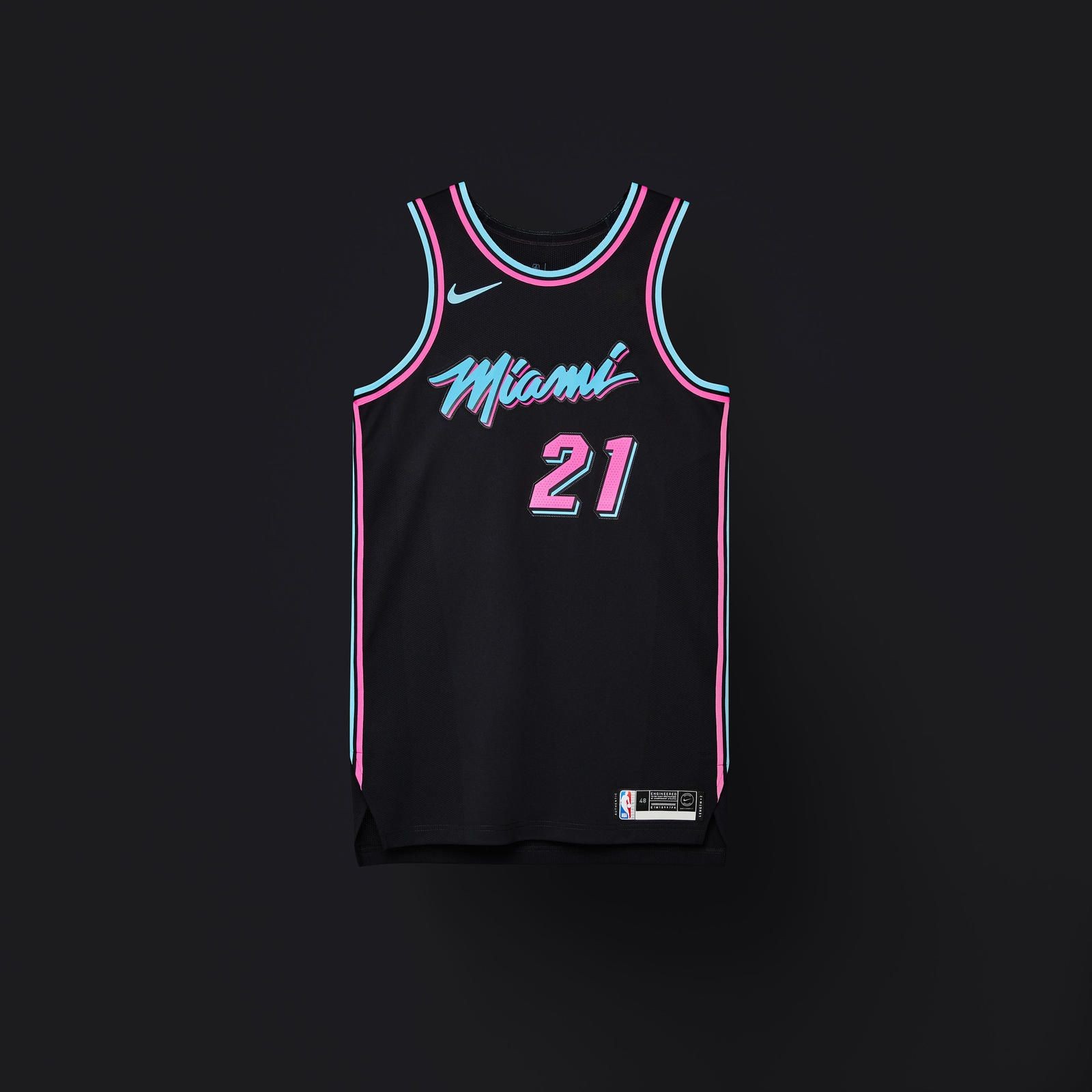
If you want something that will hold value, look for the Miami Heat City Edition jersey variants from the 2017-2019 era. Specifically, the "Vice Nights" black jersey remains the gold standard for versatility. It goes with anything.
For those who want to represent the current "Culture" era, the 2023-24 black-on-black jerseys are the way to go. They are subtle enough for everyday wear but distinct enough for anyone who knows basketball to recognize the "Culture" script.
Stay away from the over-designed Mashup jerseys unless you have a deep, personal connection to all the different eras represented. They are "collector's items" that don't always age well as fashion pieces. Stick to the bold, single-concept designs.
Keep an eye on the official Miami Heat Store (The Miami Heat Store) rather than general big-box retailers. They often get exclusive "Earned Edition" or "City Edition" variations that don't hit the mass market. If you see a design you love, buy it. These jerseys are seasonal by design. Once the NBA moves to the next year's cycle, the previous City Edition is rarely restocked. You either get it during the season, or you're stuck paying 3x the price on eBay six months later.