You’ve seen it a thousand times. Four guys in dark blue parkas, standing against a stark white background, waving their arms around like they're trying to guide a plane onto a runway. It is one of the most recognizable images in music history. But if you actually try to read what they are saying, it makes absolutely zero sense.
The Beatles Help album cover is a masterclass in "it just looked better that way."
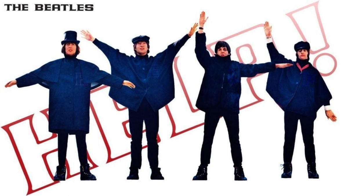
Most people assume the band is spelling out H-E-L-P in semaphore. It’s a logical guess. The movie is called Help!. The song is called "Help!". The guys are wearing capes that look like they belong on a snowy ship deck. But if you actually know your flag signals, you’ll realize the Beatles are currently screaming "NUJV" at you. Or, depending on how you interpret the arm angles, maybe "NVUJ." Either way, it isn't English.
The Day Photography Trumps Language
Robert Freeman was the man behind the lens. He had already established himself as the band's go-to guy after shooting the moody, half-shadowed With The Beatles cover. By 1965, the Beatles were exhausted. They were filming a movie, recording an album, and touring the world.
When they showed up at Twickenham Film Studios for the photo session, the plan was simple. Spell out the title.
"I had the idea of semaphore spelling out the letters HELP," Freeman later recalled. It was a clean, graphic concept that suited the mid-sixties aesthetic perfectly. The parkas were actually costumes from the film’s "filming in the Alps" sequence, which provided a nice textural contrast to the white studio backdrop.
But there was a problem.
Why NUJV happened
The human body is weird. When you try to pose four people in specific, rigid semaphore positions, it doesn't always look like a pop masterpiece. Some letters look cluttered. Some look stiff.
When John, Paul, George, and Ringo tried to spell H-E-L-P, the composition felt "off" to Freeman. The arm positions for those specific letters created a visual rhythm that didn't flow. Specifically, the "H" was awkward, and the "L" looked strange next to the "P."
So, they improvised.
Freeman began directing their arms based purely on the lines and shapes they created in the frame. He didn't care about the maritime alphabet anymore; he cared about the negative space. The result was a set of positions that looked balanced and energetic. John Lennon is the "U" (or a very enthusiastic "V"), George Harrison is the "N," Paul McCartney is the "J," and Ringo Starr is the "V."
It’s basically the 1965 version of "doing it for the aesthetic."
Breaking Down the Positions
If you look closely at the UK Parlophone release, the arrangement is specific. But then, because the music industry loves to make things complicated, the American version changed everything.
On the British cover:
- George Harrison (Left): He is signaling "N."
- John Lennon (Middle-Left): He is signaling "U."
- Ringo Starr (Middle-Right): He is signaling "V."
- Paul McCartney (Right): He is signaling "J."
Wait. It gets weirder.
When Capitol Records got their hands on the photos for the US release, they decided they didn't like the order. They rearranged the boys. Why? Probably to make the layout fit their specific "Soundtrack" branding. On the US cover, the Beatles are scrambled, yet they still don't spell "HELP." It’s a different kind of gibberish.
Honestly, it’s a miracle nobody at the record label double-checked this with a Boy Scout.
The Wardrobe Choice: Those Blue Parkas
The clothing is as iconic as the poses. Those navy blue wrap-around coats weren't just random fashion. They were designed by Julie Harris, the costume designer for the Help! film.
The movie was a zany, Bond-spoofing caper that took the band from London to the Austrian Alps and the Bahamas. The "winter" look of the cover was a direct tie-in to the skiing scenes. Interestingly, the band hated the cold, but they loved the look. The capes gave them a uniform appearance without being the "mop-top suits" of 1963. It showed a band that was evolving, getting a bit more eclectic, and moving toward the experimentalism of Rubber Soul.
The simplicity of the white background was also a deliberate choice. Freeman wanted something that would pop on a record store shelf. In a sea of busy, colorful covers, a giant white square with four distinct blue figures was impossible to miss.
Why the Cover Still Works Today
We live in an era of "Easter eggs." If a modern artist put semaphore on a cover, fans would spend three weeks on Reddit decoding it to find a secret release date for a new single.
In 1965, the Beatles were just being pragmatic.
The Beatles Help album cover works because it captures a specific moment in pop culture where the "vibe" mattered more than the literal meaning. It’s an early example of branding over accuracy.
There's also the "secret" Paul theory. Look at Paul McCartney on the far right of the UK cover. He’s the only one pointing his arms toward the other three. Conspiracy theorists (the same ones who would later obsess over the Abbey Road "Paul is dead" clues) tried to claim this was a sign of his separation from the group.
In reality? He was probably just trying to fit his arms into the frame.
Key Design Takeaways
- Visual Balance > Literal Truth: If the "correct" way looks bad, change it. Freeman’s decision to prioritize the composition over the spelling is why we still talk about this cover 60 years later.
- The Power of Uniformity: Having the band in matching outfits—but with individual poses—created a "team" identity while allowing their personalities to show through.
- Minimalism Wins: By stripping away the background, the focus stays entirely on the subjects.
The Legacy of NUJV
Over the years, dozens of artists have parodied this cover. From The Simpsons to The Rutles, everyone has taken a crack at the semaphore pose. Most of those parodies actually do spell out the title of their respective projects, which is a bit ironic. The copycats are more accurate than the original.
Even the Beatles themselves seemed to find the whole thing funny. In later interviews, Lennon would joke about the chaotic nature of their filming and recording schedules. They were moving so fast that "NUJV" was probably a pretty accurate description of how their brains felt at the time.
How to Spot an Original UK Help! Cover
If you're a collector looking for the real deal, there are a few things to keep an eye on beyond just the arm positions.
- The Mono vs. Stereo Factor: Original UK mono pressings (PMC 1255) are highly coveted. The mix is punchier and, according to many audiophiles, how the band intended it to be heard.
- The Flipback Sleeve: Original 1965 UK covers have "flipbacks"—small tabs of the front cover that fold over onto the back. It’s a hallmark of Garrod & Lofthouse printing from that era.
- The "Gramophone Co." Rim Text: On the label itself, the text around the edge should start with "The Gramophone Co. Ltd." If it says "EMI Records Ltd," you’ve got a later reissue from the 70s.
Actionable Next Steps for Fans
If you want to dive deeper into the visual history of the band, don't just stop at the cover art.
Watch the movie Help! in 4K. You can see the parkas in action during the "Ticket to Ride" sequence. It gives you the full context of the "Alpine" aesthetic Robert Freeman was trying to capture.
Compare the UK and US tracklists. The US version of Help! is mostly instrumental film score tracks with only a handful of actual Beatles songs. To hear the album as a cohesive musical statement, you absolutely have to listen to the UK Parlophone version. It includes "Yesterday" and "I've Just Seen a Face," which were stripped off the US version to be saved for Rubber Soul.
Try the semaphore yourself. If you want to spell the real "HELP," here is how you do it:
- H: Both flags pointed down at 45-degree angles (like a wide "V" pointing at the ground).
- E: Right arm up at 45 degrees, left arm down.
- L: Right arm straight up, left arm down at 45 degrees.
- P: Right arm straight up, left arm horizontal to the side.
Stand in front of a mirror and compare that to the album cover. You'll see immediately why Robert Freeman changed it. The real "HELP" looks like a disorganized traffic cop. "NUJV" looks like a rock band.
The Beatles Help album cover remains a perfect reminder that sometimes, the "mistake" is actually the masterpiece. It wasn't about the flags. It was about the four faces that were changing the world, one misspelled word at a time.