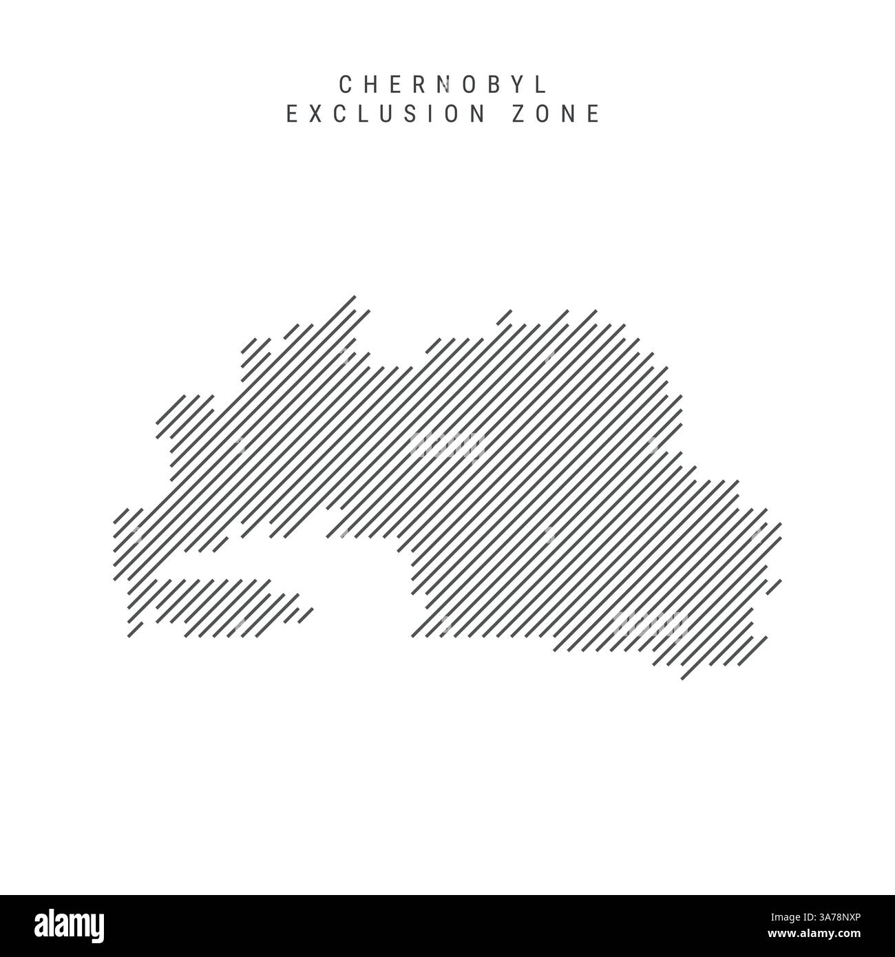
It looks like a bullseye. On paper, at least. If you search for a Chernobyl exclusion zone map, you usually see two concentric circles—the 10-kilometer inner zone and the 30-kilometer outer zone—radiating out from the remains of Reactor 4.
But radiation doesn't care about geometry.
When the reactor blew on April 26, 1986, the wind was doing its own thing. It shifted. It gusted. It carried radioactive isotopes like Iodine-131, Cesium-137, and Strontium-90 in long, jagged streaks across the landscape. The result? A map that looks less like a target and more like a spilled inkblot that leaked across the borders of Ukraine and Belarus.
Honestly, if you’re planning to visit or just curious about the geography of the world’s most famous disaster, you’ve got to realize the "Zone" is a legal boundary, not a biological or radiological one. Some spots twenty miles away are cleaner than spots five miles away. It’s weird. It’s haunting. And it’s constantly changing as the isotopes decay and the forest literally swallows the Soviet architecture.
How to Actually Read a Chernobyl Exclusion Zone Map
Most people think the borders were drawn based on careful scientific measurement in the first forty-eight hours. Not really. In the chaos of the evacuation, Soviet officials basically drew a circle with a compass on a military map. It was a "better safe than sorry" administrative decision.
However, if you look at a modern radiological Chernobyl exclusion zone map, you'll see the "Western Trace" and the "Northern Trace." These are the literal paths of the radioactive clouds. The Western Trace is a narrow, highly contaminated strip where the initial plume settled. You could be standing in a field that is relatively safe, walk five hundred yards to the left, and your dosimeter will start screaming because you’ve stepped into a "hot" patch that hasn't moved in forty years.
The Two Countries Problem
The map is split between Ukraine and Belarus. This is a huge detail people miss. Ukraine has about 2,600 square kilometers of the Zone. Belarus has the Polesie State Radioecological Reserve, which is actually more contaminated in many areas because of the wind direction during the fire.
The Belarusian side is much stricter. While Ukraine turned Pripyat into a dark-tourism magnet (at least until the 2022 invasion), the Belarusian side remained a giant, closed-off laboratory. You can't just hop the fence there. It’s a different world.
The Red Forest and the Soil Secrets
If you zoom in on a detailed Chernobyl exclusion zone map, you’ll see a patch just west of the power plant. This is the Red Forest. It’s arguably the most radioactive outdoor site on the planet. The pine trees turned ginger-brown and died from the sheer intensity of the radiation.
The Soviets bulldozed the trees and buried them in trenches.
The problem? The map doesn’t show you what’s underground. Those trees are rotting, and the radioactive material is leaching into the groundwater. When you look at the map of the Zone today, you have to consider the Pripyat River. It flows into the Dnieper, which feeds the water supply for Kyiv.
Engineers have built massive dykes to keep the contaminated silt from moving. So, the map isn't just a guide for tourists; it’s a blueprint for a massive, ongoing hydraulic engineering project designed to keep millions of people from drinking Cesium.
Is Pripyat Even on the Map Anymore?
Technically, yes. But it’s a ghost. If you look at satellite imagery from 1986 versus 2026, the city is disappearing. The "map" of the city streets is becoming irrelevant because the forest is winning. Roofs are collapsing. The iconic Ferris wheel is rusting into the dirt.
Researchers like Dr. Timothy Mousseau, who has spent decades studying the birds and bugs in the Zone, use GPS-tagged maps to track how radiation affects DNA. His maps show that life is everywhere, but it’s not "thriving" in the way some optimistic documentaries suggest. The map of the Zone is a map of a massive evolutionary experiment.
The 2022 Invasion and the New Map Reality
We have to talk about the war. When Russian forces crossed from Belarus into Ukraine in February 2022, they drove heavy tanks right through the most contaminated parts of the Zone. They dug trenches in the Red Forest.
This literally changed the Chernobyl exclusion zone map.
By churning up the soil, they released "trapped" radiation back into the air. Dust that had settled decades ago was suddenly airborne again. Sensors across the Zone showed a massive spike in gamma radiation. While the levels settled after they left, the physical map of the Zone is now littered with landmines and unexploded ordnance.
The "Zone" is now a double danger. You have the invisible threat of the 1986 isotopes and the very visible, very modern threat of military explosives. No one is wandering off the paved roads anytime soon.
Beyond the 30km Circle
The "Exclusion Zone" is just the area where people aren't allowed to live. But the "Zone of Alienation" spills far beyond that. There are villages in Belarus and Ukraine where people still live, but they are forbidden from eating the local mushrooms or berries.
Milk from cows in these "outer" zones is still monitored.
- The Samosely: These are the "self-settlers." Mostly elderly people who refused to leave or snuck back in.
- The Checkpoints: Dityatki is the main entry point from the south.
- The New Safe Confinement: The giant silver arch you see on Google Earth. It’s the largest movable metal structure ever built.
Navigating the Future of the Zone
The map is shrinking and growing at the same time. Ukraine has discussed turning parts of the outer zone into a solar farm. Why not? You can't grow crops there, but you can definitely catch some rays to power the grid.
There's also the push to make it a UNESCO World Heritage site.
If that happens, the Chernobyl exclusion zone map will become an official museum layout. It’s a weird transition from a disaster site to a tourist destination to a war zone and back again.
What You Should Do If You're Tracking This
If you are a researcher, a student, or just someone fascinated by urban decay, don't rely on the static circles you see on Wikipedia. Use the Chornobyl Center’s resources or the State Agency of Ukraine on Exclusion Zone Management (SAUEZM). They have the most up-to-date data on where it's actually safe to walk.
- Check the live radiation sensors: Many are public and online.
- Understand the isotopes: A map of Iodine-131 is gone (it has a short half-life). A map of Plutonium will look the same for thousands of years.
- Acknowledge the military status: The Zone is a border region during an active war. Access is currently restricted for safety, not just science.
The most important thing to remember is that the map is a living document. It represents a moment in 1986 that froze in time, but the physical reality is rotting, shifting, and being reclaimed by the earth every single day. You aren't just looking at a piece of geography; you're looking at a timeline.
Avoid the Red Forest. Stick to the paved roads on the official tour maps. And never, ever touch the moss. Moss is a radiation sponge. If you see a beautiful, green carpet of moss on a Pripyat sidewalk, keep your distance. That's a "hot spot" the map might not tell you about, but your dosimeter definitely will.
For anyone looking to dive deeper, the most actionable thing you can do is look into the "Open Data" portals provided by the Ukrainian government regarding the ecological status of the Zone post-2022. These datasets provide the most accurate, ground-level truth of what the Zone looks like right now, beyond the old Soviet circles.