Time is weird. We spend our whole lives chasing it, yet most of us rarely stop to look at how we actually visualize it. When you search for pictures of a clock, you aren't just looking at a tool for measurement. You're looking at a very specific, highly engineered piece of visual psychology.
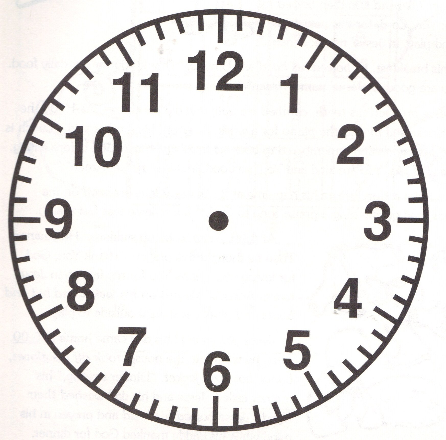
Take a look at your phone. Now, look at a stock photo. Notice anything? Almost every single professional photograph of an analog clock—whether it’s a Rolex, a Timex, or a cheap plastic wall clock from a big-box store—is set to 10:10. It’s a trope. It’s a standard. Honestly, it’s basically a law of marketing at this point.
But why?
Some people will tell you it’s because that’s the time JFK was shot, or maybe Lincoln. That is total nonsense. Neither of those events happened at 10:10. Others claim it's a tribute to the atomic bomb. Also wrong. The real reason is much more "lifestyle" and much less "conspiracy theory." It’s about the "V" shape.
The Psychology Behind Pictures of a Clock
Think about the human face. When the hands are at 10 and 2, they create a framing effect. It looks like a smile. It’s welcoming. If you set the hands to 4:40, the clock looks like it’s frowning. Nobody wants to buy a sad clock. It sounds silly, but brands like Apple and Omega spend millions of dollars studying how these micro-expressions in objects affect your brain’s dopamine levels.
Beyond the "smile," there’s the issue of branding. Watchmakers usually put their logo right under the 12. If you put the hands at 12:00, you hide the brand. If you put them at 9:15, one hand cuts right through the name. 10:10 frames the logo perfectly. It’s like a spotlight.
Marketing isn't the only thing driving our obsession with these images. There is a deep, almost primal satisfaction in the symmetry of a well-shot timepiece.
Capturing the Movement: Why It’s Harder Than It Looks
Taking high-quality pictures of a clock is a nightmare for photographers. You’ve got glass. You’ve got polished metal. You’ve got tiny, moving parts. It’s a recipe for glare.
Professional photographers often use "museum glass" or specialized polarizing filters to kill the reflection. If you’re trying to snap a photo of your grandfather’s old watch at home, you’ve probably noticed your own face reflecting in the crystal. It’s annoying. To get around this, pros use a light box or a "tent" to create soft, even light that doesn't bounce back harshly.
And then there's the "second hand problem."
In a long exposure, the second hand becomes a blur. It looks like a ghostly smear across the dial. To fix this, photographers either hack the movement to stop the clock or they take multiple shots and stack them in Photoshop. It’s a lot of work for a single image.
Real Examples of Iconic Clock Imagery
We see these images everywhere, but some have become cultural touchstones.
- The Doomsday Clock: This isn't a real physical clock in the way most people think. It's a symbolic representation maintained by the Bulletin of the Atomic Scientists. When you see pictures of this "clock," the hands are usually terrifyingly close to midnight. It’s the ultimate example of using a clock image to convey urgency and dread rather than "lifestyle" vibes.
- Big Ben (Elizabeth Tower): Probably the most photographed clock in the world. Interestingly, getting a clear shot of the faces requires immense distance because of the tower's height. Most "close-up" photos you see are actually taken with massive telephoto lenses from across the bridge.
- The Grand Central Terminal Clock: Located in New York, this opal-faced masterpiece is rumored to be worth between $10 million and $20 million. Photographers flock here because the brass and the warm lighting create a "vintage" aesthetic that is almost impossible to replicate in a studio.
Lighting and Composition Secrets
If you're actually trying to take your own pictures of a clock, stop using your flash. Just don't do it. Flash hits the glass and bounces straight back into the lens, creating a white "hot spot" that ruins the detail.
Instead, try side-lighting. Put the clock near a window, but not in direct sunlight. Let the light "rake" across the surface. This creates shadows in the engravings and gives the Roman numerals or ticks some depth. It makes the clock look three-dimensional.
Macro photography is another rabbit hole. When you get really close—I'm talking "can see the dust on the gears" close—you start to appreciate the engineering. This is where the "gearheads" (pun intended) live. They want to see the escapement, the hairspring, and the jewels.
Common Misconceptions About Clock Photos
People often think that "vintage" looking clock photos are just filtered. Not always. A lot of that "look" comes from the lens choice. Older lenses—glass from the 60s or 70s—often have a "glow" or a lower contrast that modern, ultra-sharp digital lenses can't mimic perfectly.
Another myth? That digital clocks are easier to photograph.
Actually, digital displays (especially LED or LCD) have refresh rates. If your camera’s shutter speed is too fast, you might end up with a picture where the numbers look half-faded or flickered out. You have to sync your shutter speed to the frequency of the display. It's a technical headache that makes analog clocks look like a piece of cake by comparison.
Practical Steps for Better Timepiece Visuals
Whether you are a collector looking to document your inventory or an artist wanting to capture the essence of "time," here is how you actually get the job done without losing your mind.
Clean the glass. This sounds obvious. It isn't. Even a fingerprint you can’t see with your naked eye will show up like a crime scene under a high-resolution camera. Use a microfiber cloth and a puff of air.
Watch your angles. If you are shooting straight on, you are the reflection. Tilt the clock just a few degrees away from the camera. This moves the reflection of the lens out of the center of the frame.
Control the "Sweep." If you want that smooth, high-end look where the second hand looks like it's moving, use a tripod and a slightly slower shutter speed (around 1/10th of a second). If you want it pin-sharp, you need plenty of light and a fast shutter (1/250th or higher).
Mind the background. A clock is a busy object. It has numbers, hands, and textures. Don't put it on a busy tablecloth. Use a neutral, solid surface—wood, slate, or even a dark piece of fabric. Let the clock be the hero of the image.
Use a "Prop" Hand. If you're serious, use a tiny piece of "rodico" (a specialized jeweler's putty) to hold the hands in place if the movement is broken. This allows you to set that "10:10" position manually without waiting for the right time of day.
High-quality pictures of a clock rely on the balance between technical precision and emotional resonance. The best images don't just show you what time it is; they make you feel the weight of the seconds passing. By controlling reflections, choosing the right time-setting for "facial" expression, and using soft, directional light, you transform a simple tool into a work of art.
Start by experimenting with a single light source and a smartphone. Move the light around the clock until the "smile" of the 10:10 position catches the glint of the crystal. Focus on the center pin where the hands meet; if that's sharp, the rest of the image usually feels right to the human eye.