Dr. Seuss didn't just write a book. He created a visual manifesto. When you look at pictures of the lorax, you aren't just seeing a "shortish and mossy" creature with a yellow mustache. You are looking at one of the most enduring symbols of environmental activism in history. It is a visual that has been burned into the collective consciousness of kids and adults since 1971.
The Lorax is small. He’s grumpy. He's arguably a bit annoying. But that specific look—the orange fur, the gravity-defying eyebrows—was designed to be impossible to ignore. Theodor Geisel (the man we know as Seuss) actually drew inspiration for the character's face while on a trip to Kenya. He saw patas monkeys with their distinctive facial hair and something clicked. He realized his protagonist shouldn't be a superhero. He should be a weird little guy.
The Evolution of the Lorax Visuals
If you compare the original 1971 sketches to the 2012 Illumination film, the jump is jarring. The original book art is scratchy. It feels organic. The colors are muted in that specific "early 70s psychedelic" way, with Truffula trees that look like they belong in a dream or a fever. The Lorax himself is barely taller than a stump.
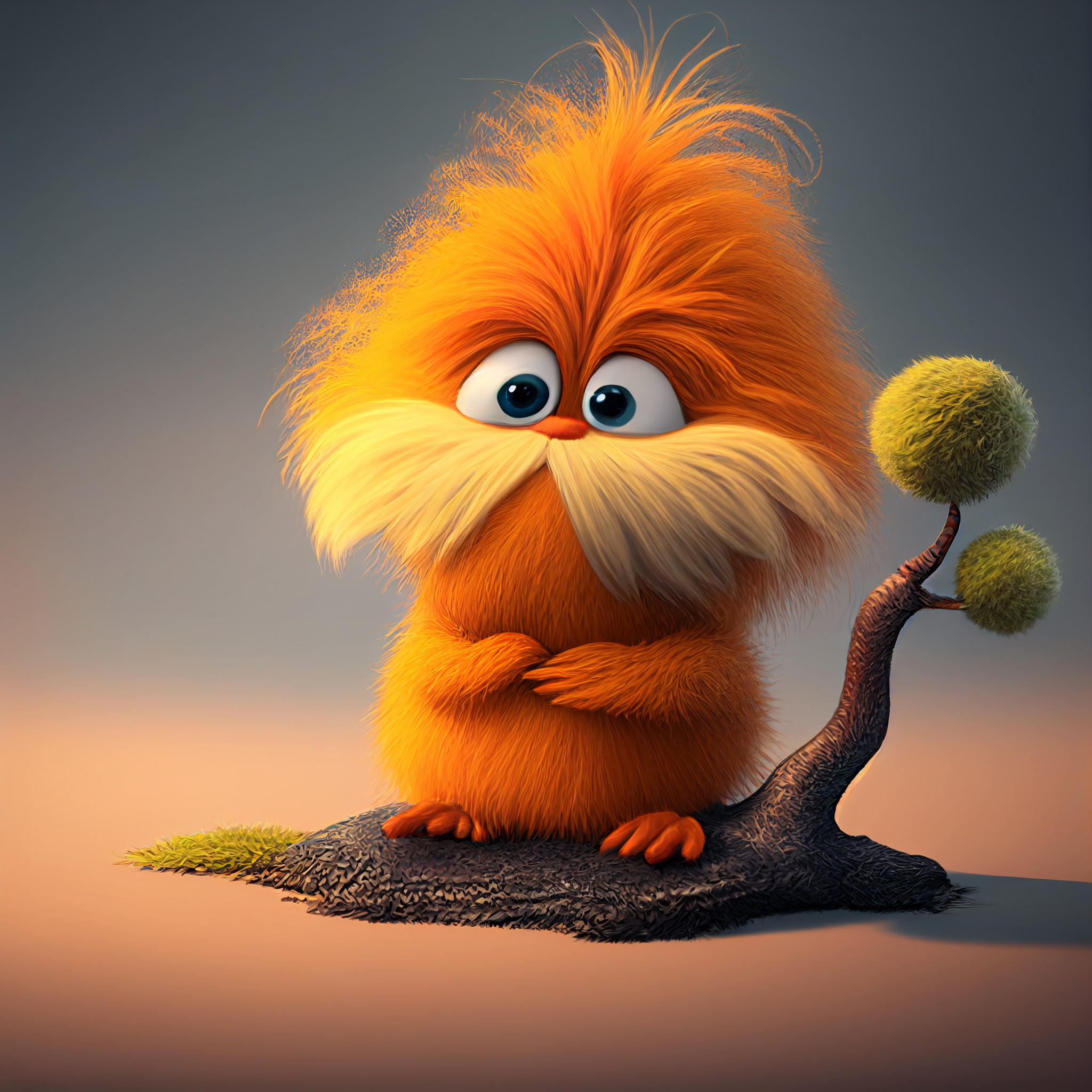
In the 2012 movie, everything changed. Digital rendering turned the Lorax into a plush, high-definition creature with individual hairs catching the light. While some purists hated it, the vibrancy of these modern pictures of the lorax helped introduce a new generation to the "Speak for the Trees" ethos. The bright pinks and oranges of the 3D world made the eventual grey, smog-filled wasteland of the Once-ler’s factory feel even more devastating. Contrast is everything.
The Original Sketches vs. The Animated Standard
Seuss was a perfectionist. He famously spent months agonizing over the exact shade of orange for the Lorax’s fur. He wanted something that looked "natural but wrong"—a creature that looked like it belonged in the woods but also stood out against the green grass.
- The 1971 Lorax: More rounded, eyes often closed or squinting, looks genuinely exhausted by the world.
- The 2012 Lorax: Voiced by Danny DeVito, this version is bouncier, more expressive, and designed for merchandise.
- The 1972 TV Special: This version sits in the middle, maintaining the "sketchy" look but adding movement that the book obviously lacked.
People often forget how dark the ending of the original story is. The visuals reflect that. The final images of the book aren't of the Lorax at all; they are of a single stone circle with the word "UNLESS" carved into it. That’s a heavy visual for a toddler to digest, but it’s why the imagery stuck.
Why Pictures of the Lorax Became a Protest Symbol
It's kind of wild when you think about it. A fictional creature from a children's book is now a staple on protest signs globally. From climate marches in New York to anti-logging protests in the Pacific Northwest, people use pictures of the lorax to make a point without saying a word.
Why does it work? Because the visual is a shortcut. Everyone knows what he stands for. When a protester holds up a sign featuring that iconic orange face, they are tapping into 50 years of shared cultural history. It tells the viewer: "I am the one speaking for the trees, because you sure aren't."
Interestingly, the Seuss Estate has been very protective of these images. They have to be. There’s a constant battle between using the Lorax to sell "green-washed" products (like the infamous 2012 Mazda SUV tie-in) and keeping the integrity of the message. Honestly, seeing the Lorax used to sell a car was one of the weirdest marketing missteps in recent memory. It felt like a betrayal of the visual's core meaning.
Visual Storytelling and the Truffula Tree
You can't talk about the Lorax without talking about the Truffula trees. Those soft, tufted tops were Seuss’s way of making nature seem vulnerable. They don't look like sturdy oaks or pines. They look like pillows.
When we see pictures of the lorax standing among the stumps, the visual weight comes from the "lost softness." The Once-ler’s factory is all sharp angles, cold steel, and black smoke. The Lorax and his trees are all curves and fluff. This visual dichotomy is taught in design schools today because it’s so effective at creating an emotional response. You don't need to read the text to know who the villain is. You just have to look at the shapes.
Misconceptions About the Lorax's Design
Some people think the Lorax is a bear. He isn't. Others think he’s a spirit or a ghost. Seuss actually described him as a "creature of the woods," implying he is biological, not magical.
Another big misconception is that the Lorax is supposed to be "cute." He really isn't. In the original book, he’s kind of a pest. He’s short-tempered. He’s bossy. The visuals support this; he isn't drawn with big "Disney eyes" or a friendly smile. He’s drawn with a scowl. This was a deliberate choice to show that you don't have to be likable to be right. You can be a grumpy, orange, hairy thing and still have a message that needs to be heard.
How to Use Lorax Imagery Today
If you are looking for pictures of the lorax for a school project or an environmental campaign, you have to be careful about the "vibe."
- Use the original 1971 art if you want to evoke nostalgia and a sense of "old-school" environmentalism. It feels more serious and grounded.
- Use the 2012 3D renders if you are talking to a younger audience who grew up with the movie. It’s more accessible and bright.
- Avoid the "commercialized" versions where he’s holding products. It dilutes the message.
The impact of the Lorax isn't just in the words. It's in the orange. It's in the mustache. It's in the way he floats away through a hole in the smog, leaving nothing but a pile of rocks. That image stays with you.
When we look back at the history of children's literature, few characters have leaped off the page to become real-world political icons. The Lorax did it because he was designed to be unmistakable. He is a warning in a bright orange suit.
Actionable Steps for Environmental Advocacy Visuals
If you're looking to channel the power of the Lorax in your own work or home, focus on these specific visual elements that have been proven to drive engagement:
- Prioritize High Contrast: Just as Seuss contrasted the bright Truffula tufts with the "Smogulous Smoke," use high-contrast imagery to highlight environmental damage. Pair vibrant "before" photos with desaturated "after" shots to mimic the Once-ler’s impact.
- Utilize the "Unless" Motif: The most powerful visual from the Lorax isn't the character himself, but the word "UNLESS." In design, leaving a single word in a stark landscape creates more psychological impact than a cluttered image.
- Audit Your Sources: When sourcing Lorax-related imagery, verify the copyright through the Dr. Seuss Enterprises website. Using fan art for non-commercial advocacy is generally seen as "fair use" in many jurisdictions, but using movie stills for business purposes will quickly lead to a cease-and-desist.
- Focus on the Eyes: Whether using the original or the modern version, the Lorax’s eyes are his most expressive feature. When creating posters or digital content, ensure the character's gaze is directed toward the viewer to create a sense of personal accountability.
The legacy of the Lorax is a reminder that a simple drawing can change how an entire generation views their responsibility to the planet. It's not just art; it's a call to action that refuses to fade away.