Most people grew up seeing 1313 Mockingbird Lane through a strictly black-and-white lens. It was the point of the show, really. While The Addams Family was doing the same "spooky but sweet" routine over on ABC, CBS had the Munsters rocking that Universal Monsters aesthetic with heavy shadows and gray scales. But if you've ever stumbled across a clip of The Munsters set in color, it probably felt like a fever dream. It’s vibrant. It’s garish. It’s actually kind of beautiful in a way that the grainy 1960s broadcasts never let us see.
The Munsters wasn't just a sitcom; it was a massive technical undertaking. Every time you see Lily or Herman in full color, you aren't just looking at a filter. You're looking at one of the most expensive TV sets of the era.
The 1964 Pilot: The Munsters Set in Color Before the World Was Ready
Technically, the show started in color. Kind of.
Before the series was greenlit, a 16-minute pitch film was produced to sell the concept to the network. This pilot—often called "My Fair Munster"—featured a completely different Eddie (Happy Derman) and a much more "vampy" Phoebe (who would later become Lily, played by Yvonne De Carlo). Most importantly, it was filmed in full color.
When you look at this footage, the first thing that hits you is the makeup. Fred Gwynne’s Herman isn't just a dull grey; he’s a sickly, neon-adjacent green. It’s jarring. The producers eventually realized that the high cost of color film—roughly $10,000 more per episode, which was huge in 1964—combined with the fact that the makeup looked "too fake" in hue, meant they should stick to the classic noir look.
They went back to black and white for the series run. It saved money. It felt "Universal."
But the color lived on in the archives, and eventually, in the feature films. By the time Munster, Go Home! hit theaters in 1966, the world finally saw the Mockingbird Lane crew in glorious Technicolor. Seeing The Munsters set in color on the big screen changed how fans perceived the house. The dusty, decaying mansion wasn't just shades of soot. It was filled with deep purples, velvet reds, and gold trim.
What Made the Set So Special?
The Munsters lived on Colonial Street at Universal Studios. You might know it better as Wisteria Lane from Desperate Housewives. The house itself was a shell, but the interior sets were a masterpiece of production design.
Everything was oversized.
Herman was a giant, so the furniture had to be scaled appropriately to make him look "monster-sized" without making the rest of the cast look like toddlers. In color, the textures of the set really pop. You notice the thick layers of "dust" which were actually blown-in gray flocking and cobwebs made of hot glue and air pressure.
- The Living Room: In the colorized versions or the 1966 film, the "Dragula" coffin-dragster isn't just a prop. It's a high-gloss metallic marvel.
- The Kitchen: Surprisingly modern for a bunch of ghouls, but with that 60s avocado-adjacent palette creeping in.
- The Lab: Grandpa’s dungeon is where the color palette really shines. Bubbling greens, glowing electrical arcs, and those iconic red liquids in the beakers.
Honestly, the black-and-white broadcast did a lot of the heavy lifting for the "scary" atmosphere. When you see the actual The Munsters set in color, the "spookiness" evaporates and is replaced by a sort of kitschy, mid-century pop-art vibe. It’s less Dracula and more Andy Warhol.
The Colorization Debate: Blasphemy or Art?
Purists hate it. They really do.
They argue that the lighting was specifically designed for black and white. The cinematographers used "rim lighting" to separate the dark costumes from the dark backgrounds. When you slap a digital color layer over that, the shadows can look muddy.
However, there is a legitimate historical thrill in seeing the show colorized. It lets you see the actual craftsmanship of the costumes. You realize Lily’s gown wasn't just white; it had subtle lavender tints. You see the detail in the wood grain of the grand staircase.
Why the "Mockingbird Lane" House Still Matters
The house is a character. That’s the bottom line.
If you visit Universal Studios today, the original house (which has been moved and renovated multiple times) doesn't look much like the Gothic ruin we love. It’s been "beautified" for other shows. But for the fans, that specific 1960s layout remains the gold standard of "Spooky Americana."
Building a set like that today would cost millions. They used real wood, heavy fabrics, and actual architectural salvage. It wasn't just plywood and green screens. That’s why the color photography of the era holds up so well—the physical depth of the objects is undeniable.
The Munsters set in color provides a bridge between the Golden Age of Monster Movies and the vibrant explosion of 1960s television culture. It’s a reminder that even in the dark, there was a lot of color behind the scenes.
How to Experience The Munsters in Color Today
If you want to see the "authentic" color versions rather than fan-made AI upscales, you have a few specific options.
First, watch the 1966 film Munster, Go Home! It’s the original cast, on the original sets (mostly), filmed with high-end theatrical color equipment. It’s the closest you’ll get to seeing the production as the actors saw it.
Second, look for the "lost" pilot on the DVD extras or specialty streaming collections. It’s a time capsule. The colors are slightly "off" because of the age of the film, but it’s a fascinating look at what could have been.
Practical Steps for Fans and Collectors
- Seek out the "Scream Factory" Blu-ray releases: They often have the best color-corrected versions of the films and pilots, avoiding that weird "pasty" look of cheap digital colorization.
- Compare the lighting: If you're a film nerd, watch a scene in black and white and then find the colorized version. Notice how the "green" makeup on Herman disappears in the gray-scale but looks almost radioactive in color.
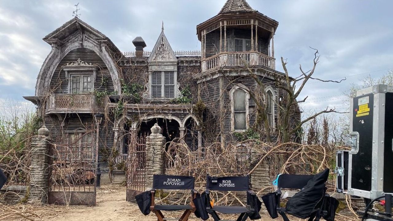
- Visit the replicas: There are fans who have built frame-for-frame replicas of the Munsters' house (there's a famous one in Waxahachie, Texas). These are often painted in the "television colors" to reflect how the set actually looked to the naked eye.
The reality of The Munsters set in color is that it wasn't meant to be seen by the public in 1964. It was a workspace. Seeing it now is like looking at the raw files of a masterpiece. It doesn't ruin the magic; it just shows you how much work went into making the "darkness" look so good.